Massimo Vignelli
Booklet
Description
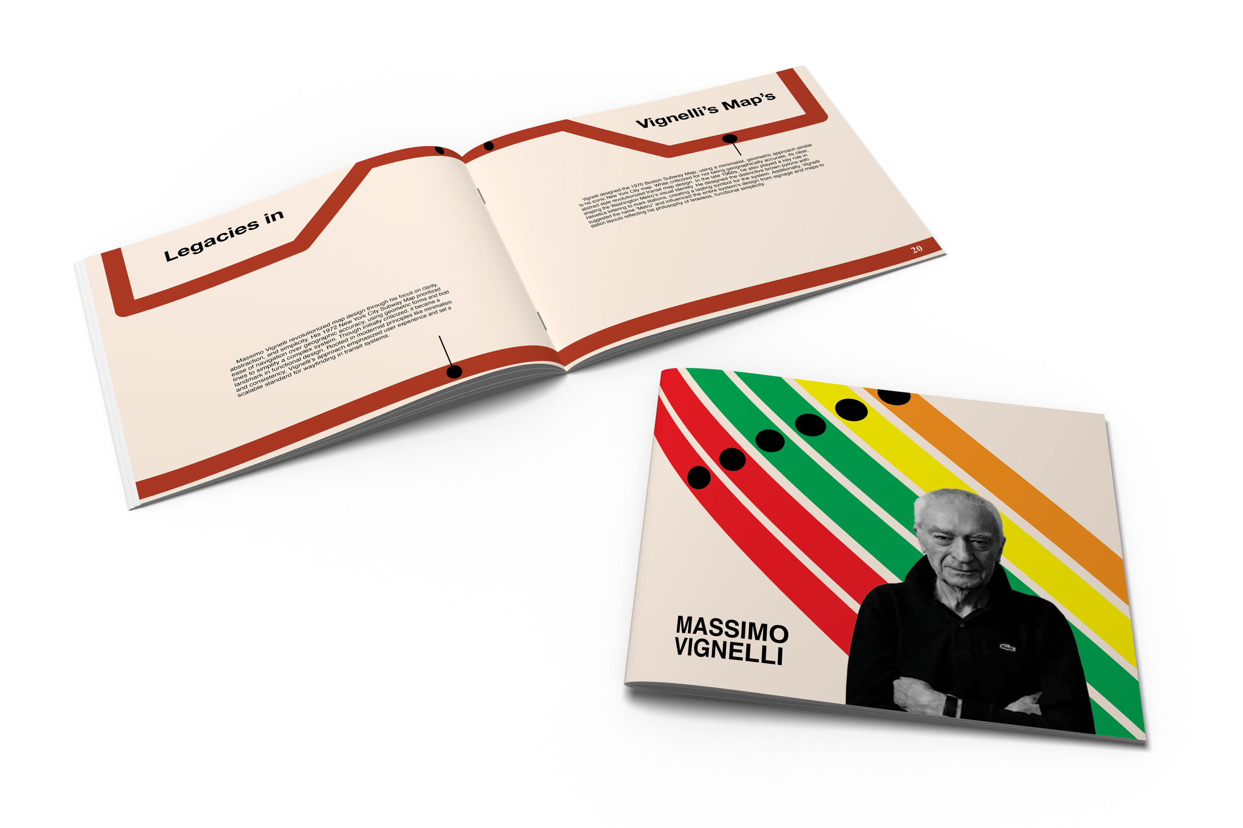
This project focused on creating a booklet centered around a design hero, an influential graphic designer who inspires our work.
Summary
I chose Massimo Vignelli for his minimal and modern approach to design, best known for the Ford logo and the New York City subway map. I centered my focus on his subway work due to my personal connection from frequently riding the metro into Washington, D.C.
Mood Board
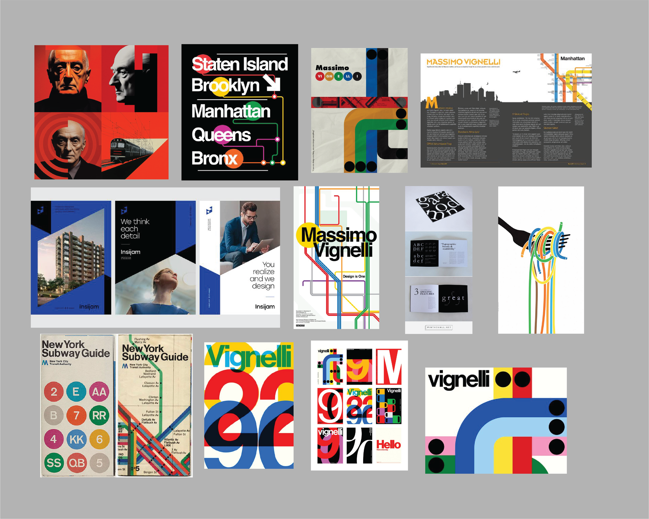
For my mood board, I knew I wanted to include elements related to metro lines and the subway system. Even though I wasn’t entirely sure how I wanted to approach the layout at first, I figured gathering a few examples would help make the process go more smoothly.
Cover Sketches
Layout Sketches
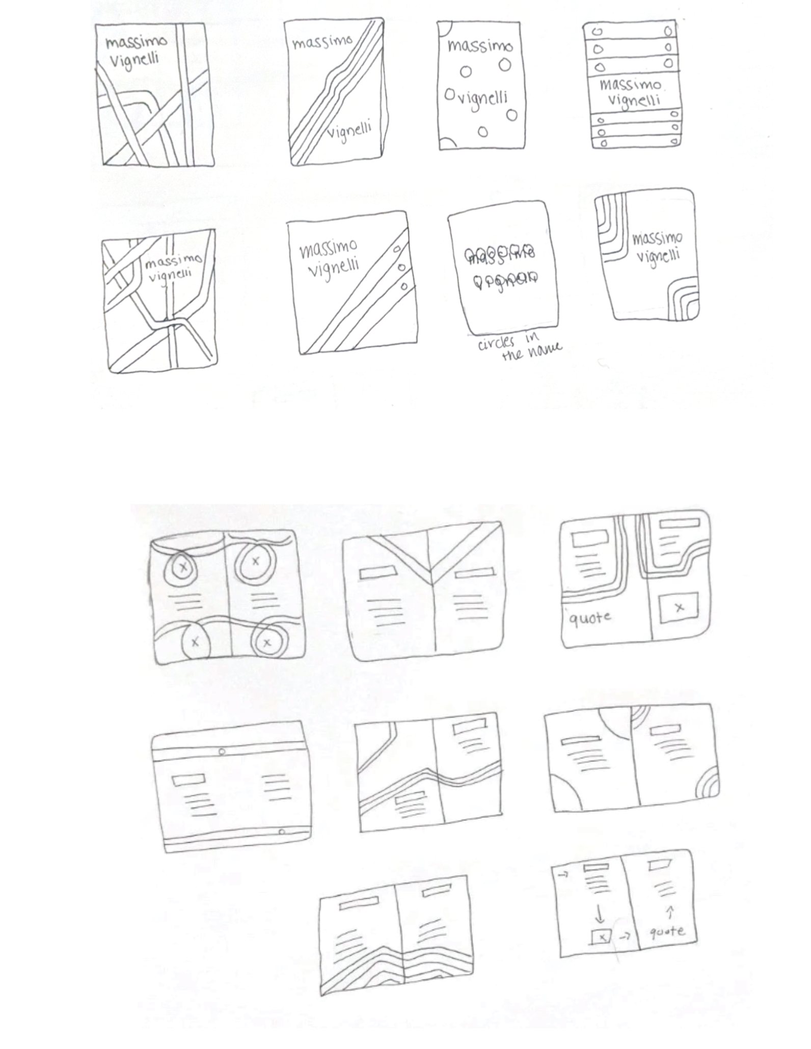
For my sketches, I selected one concept from each section and created small variations for every page. This approach helped maintain a consistent and clean aesthetic, reflecting Vignelli’s design style.
Digital Cover Drafts
Back
Front
Revisions
Original
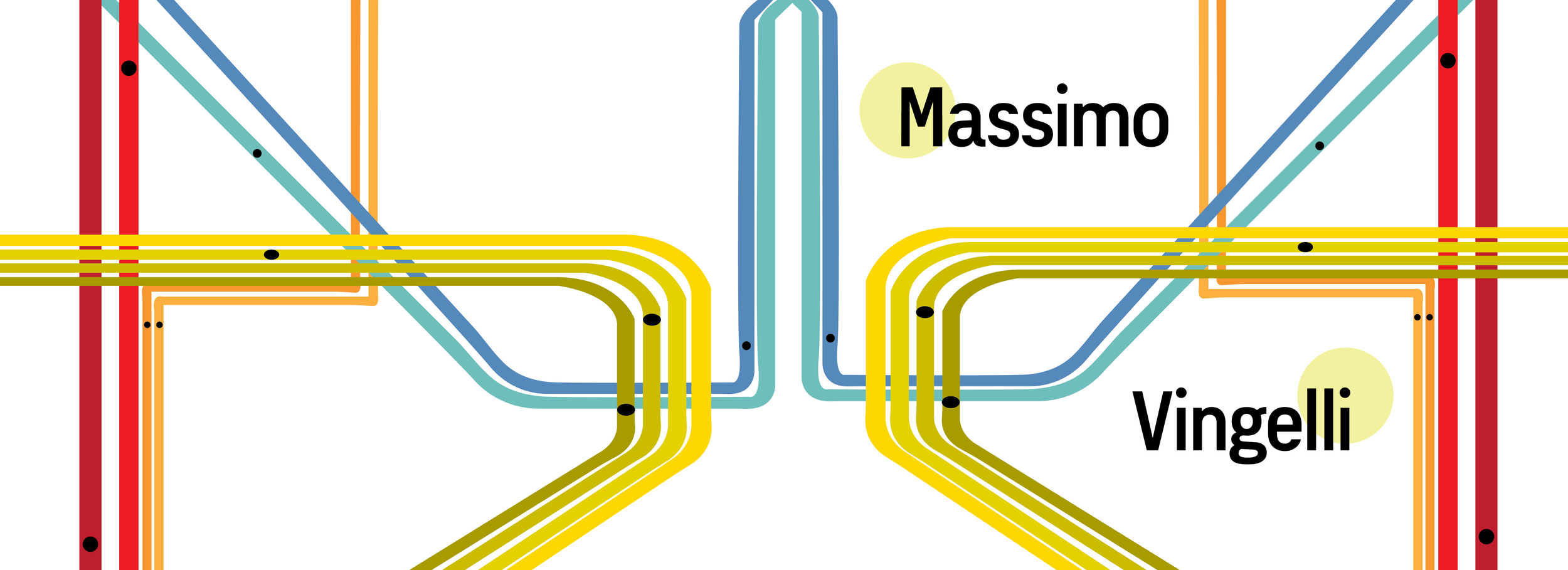
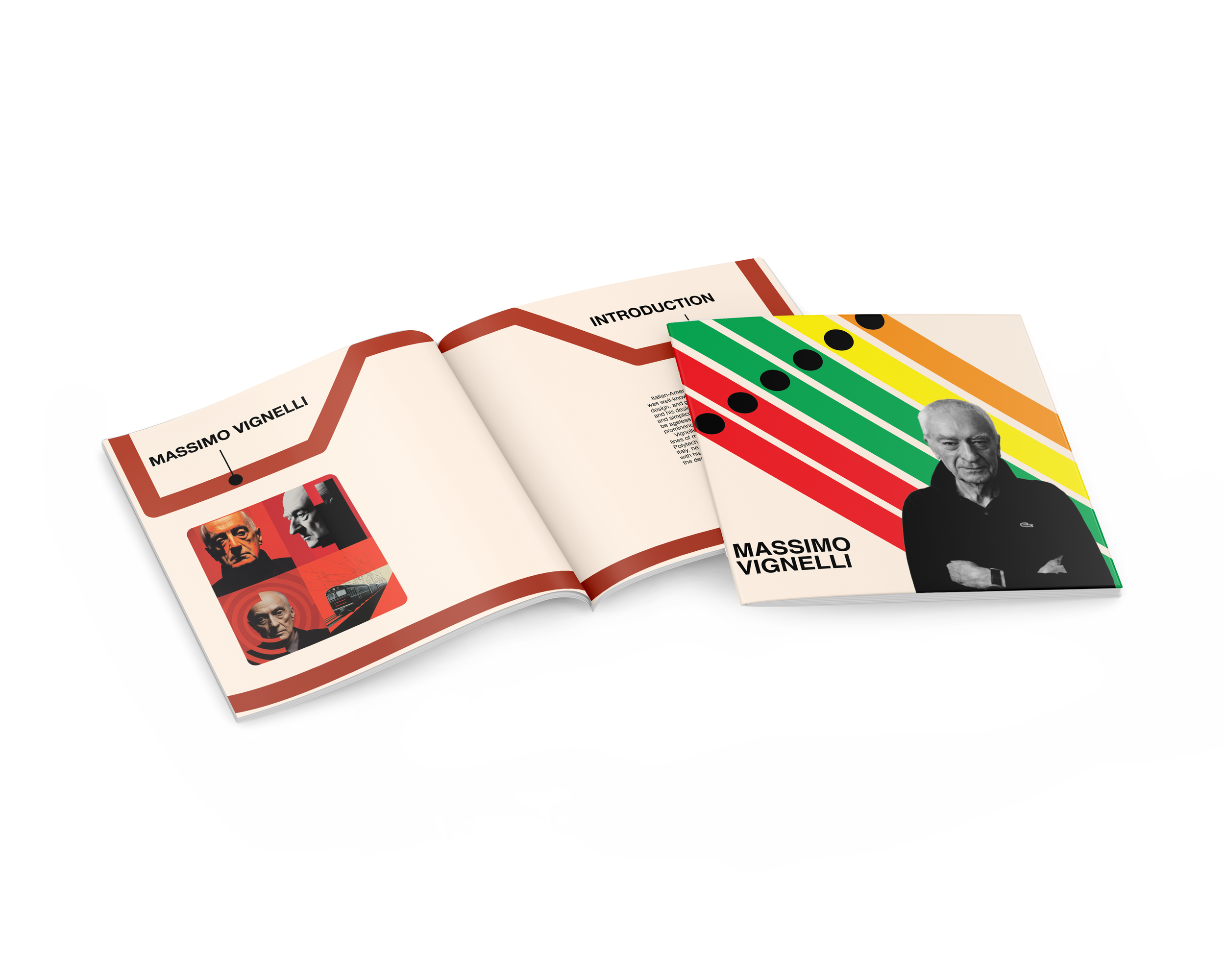
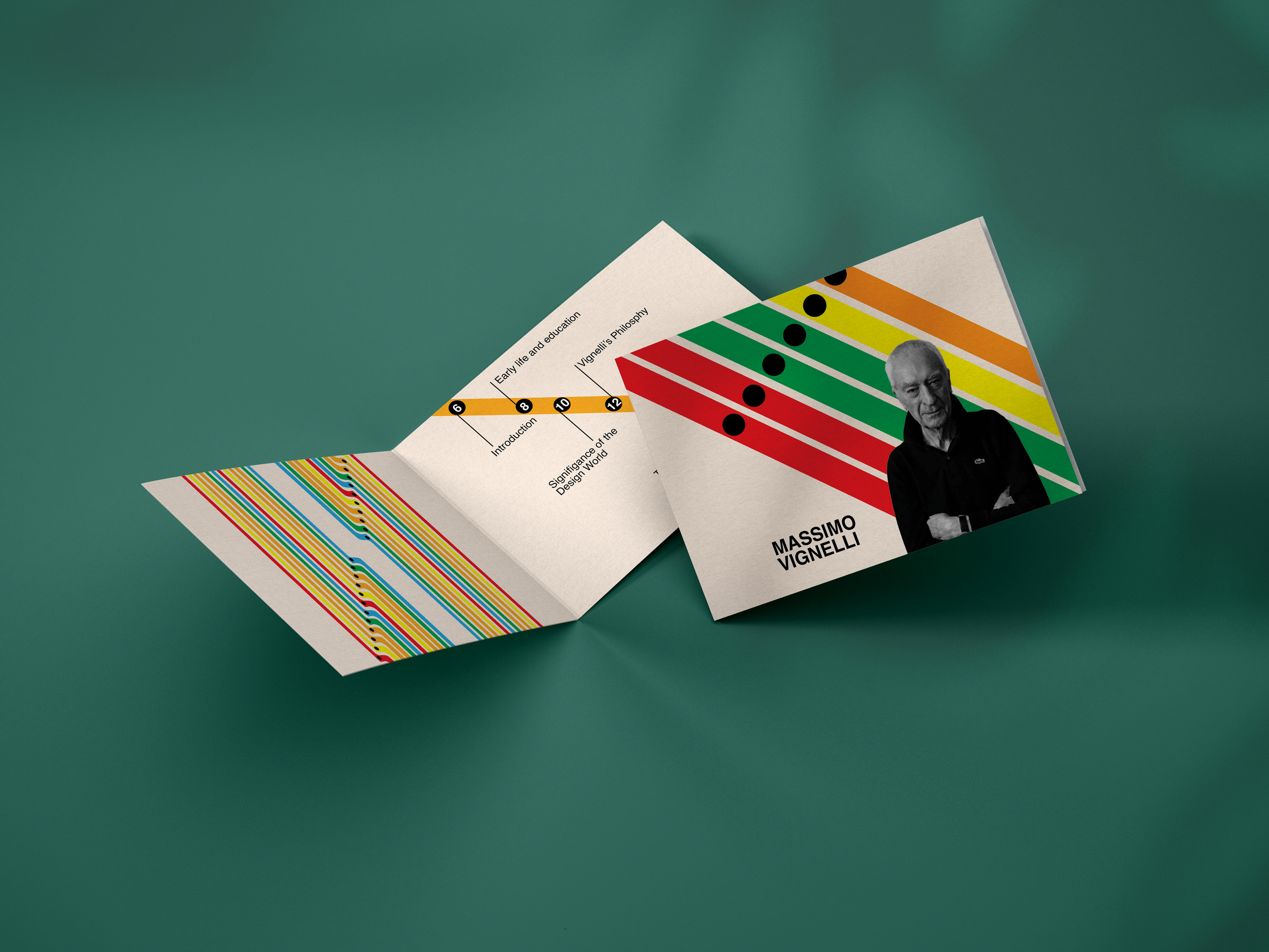
This original cover was created before my final portfolio capstone course and explores the integration of a portrait of Massimo Vignelli into the subway line design. I also took a more simplified approach, using fewer details and a more direct visual style.
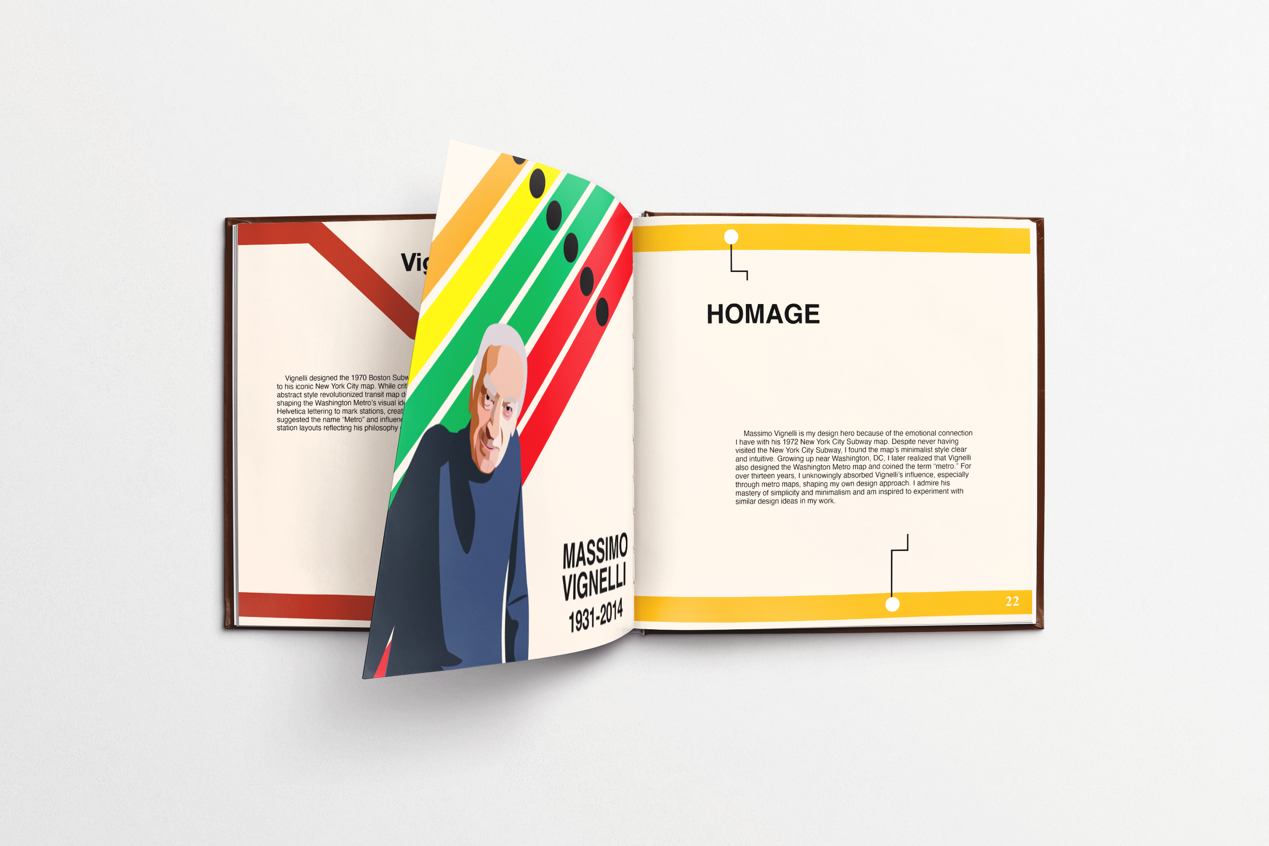
This was the final page of the booklet, which was dedicated to an homage section for the artist, accompanied by original illustrations. I chose to create a portrait of him to give the booklet a cohesive and thoughtful flow. Additionally, I adjusted the colors of the subway lines to convey a sense of mourning and reflection in honor of his passing.
Current
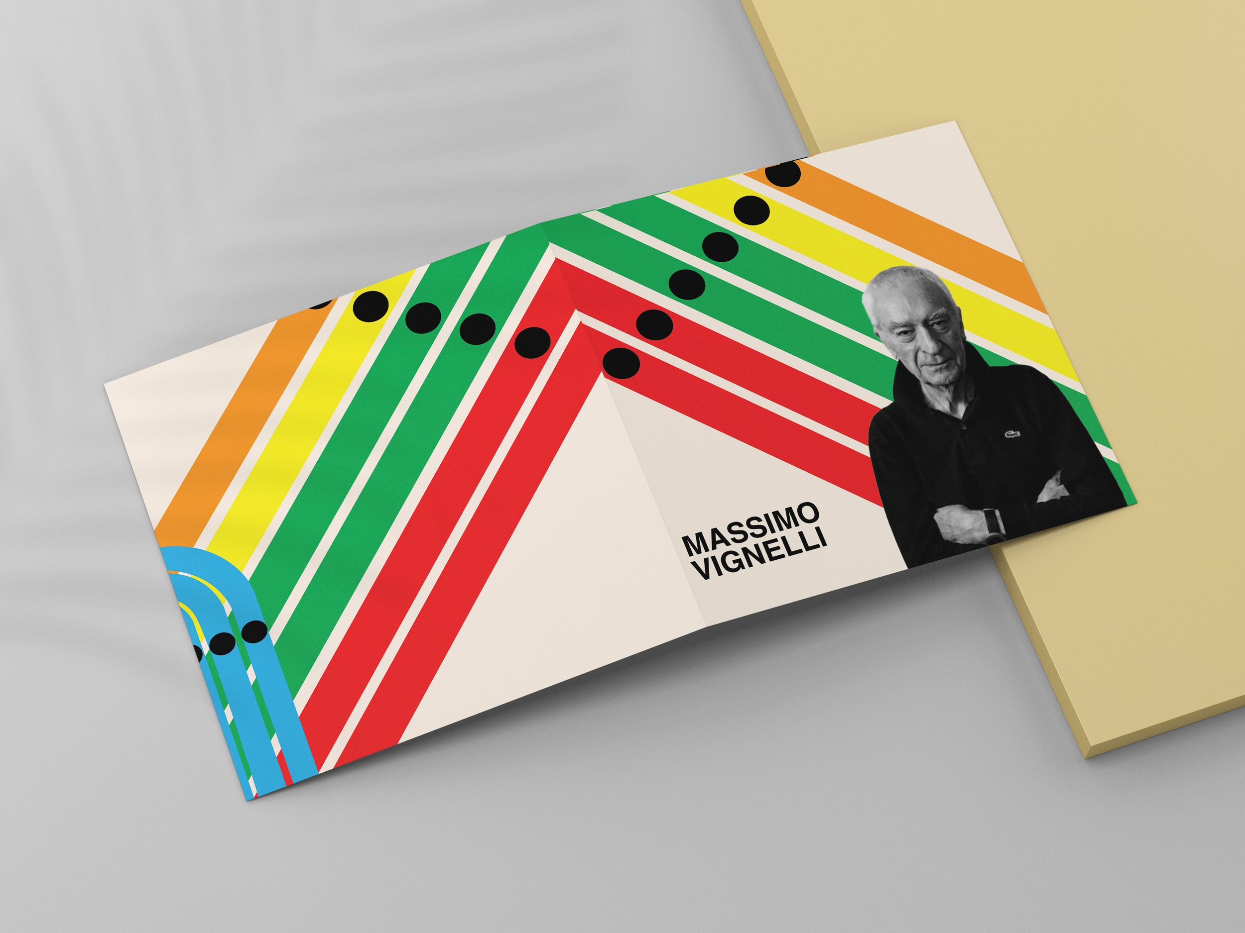
This is the finalized cover developed during my portfolio course. I enhanced the visibility of Massimo Vignelli by bringing his portrait forward and updated the type placement to the forefront to improve accessibility and impact.
This is the finalized homepage. Rather than using the black tones from earlier drafts, I chose to maintain the color flow of each subway line, keeping consistency with the color scheme assigned to each page in the booklet. I also incorporated the front cover lines into the final page to create visual continuity and adjusted the text size for improved readability and balance.