Son Lux
Description
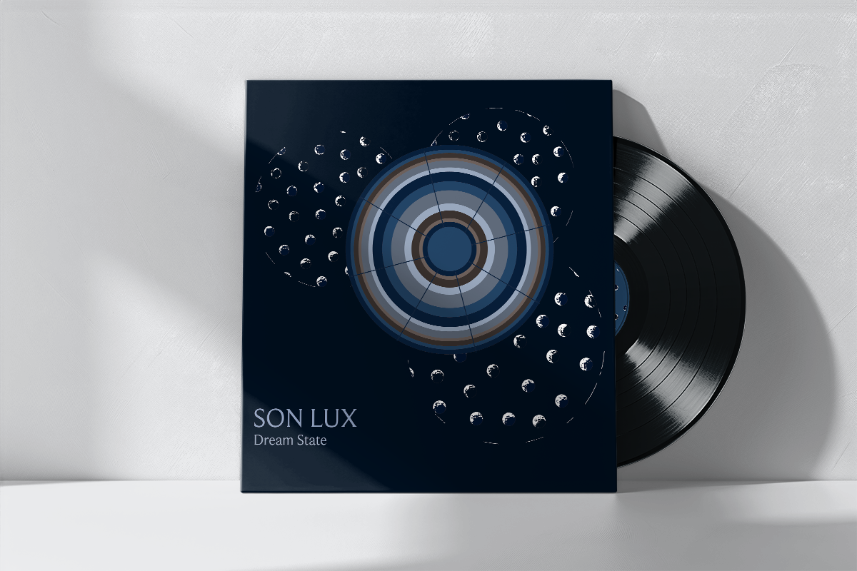
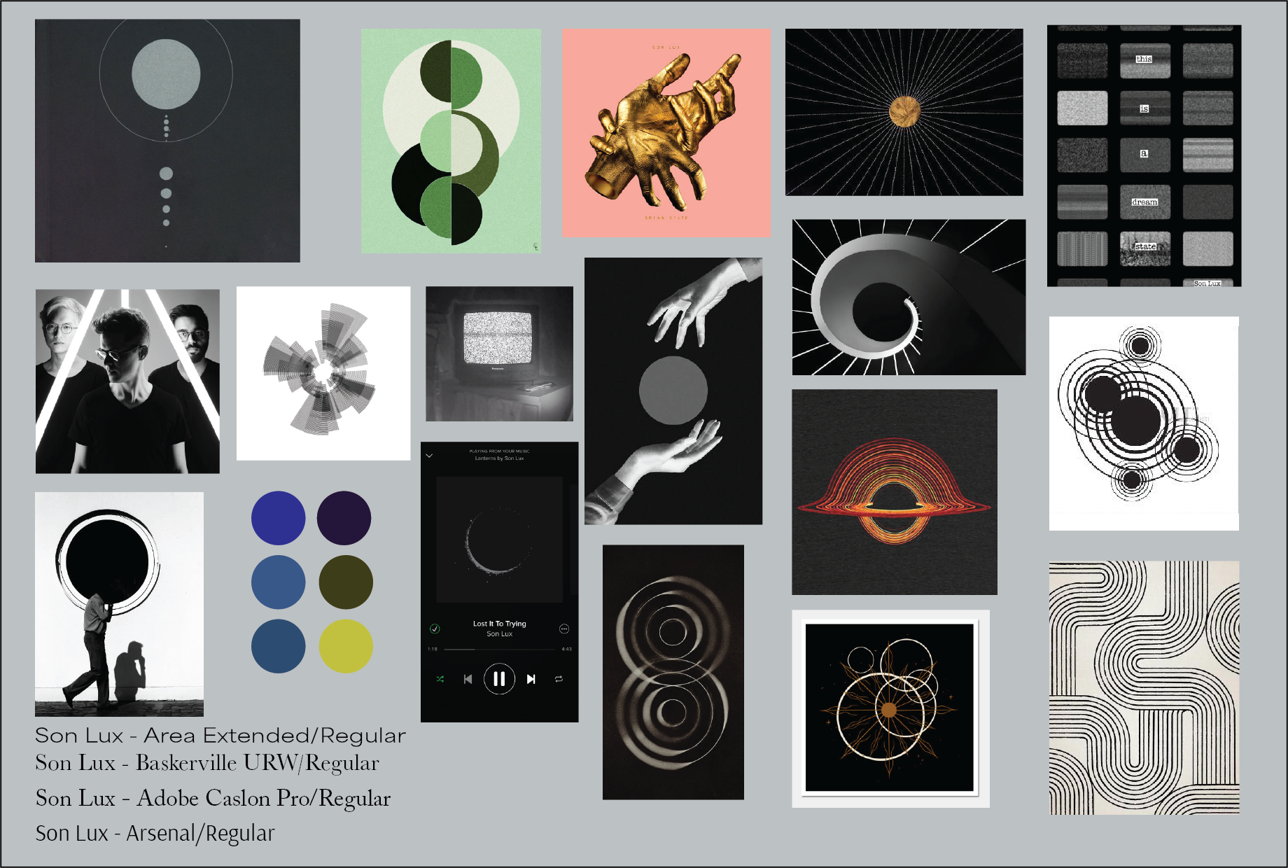
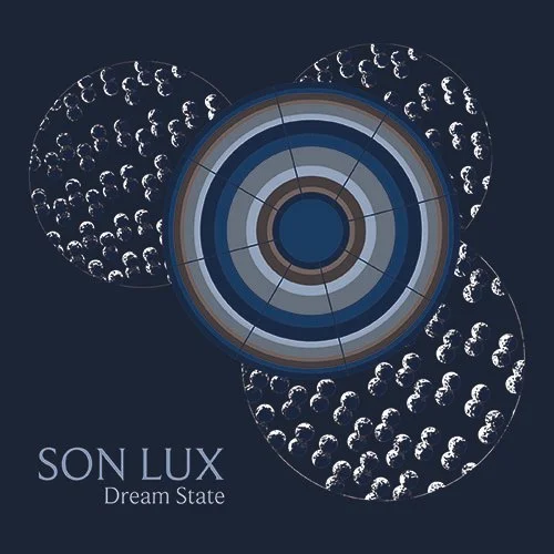
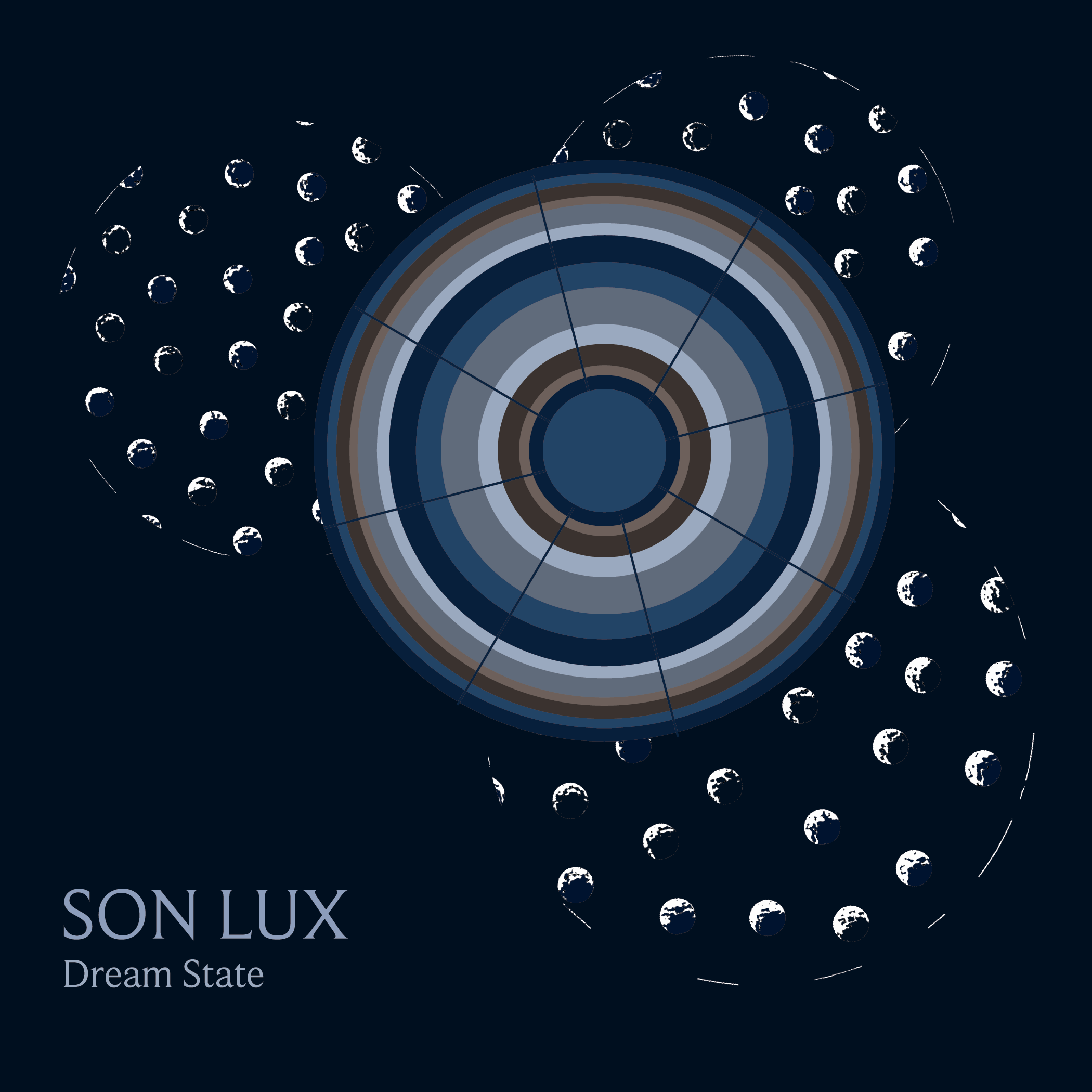
The project began with selecting an album to reinterpret, leading to Son Lux’s Brighter Wounds for its exploration of loss, fear, beauty, renewal, and pain. While the album offers a broad emotional range, the concept was focused on the track “Dream State,” which captures both joy and deep grief. The final design seeks to visually balance these opposing emotions while subtly reflecting the album’s overarching themes.
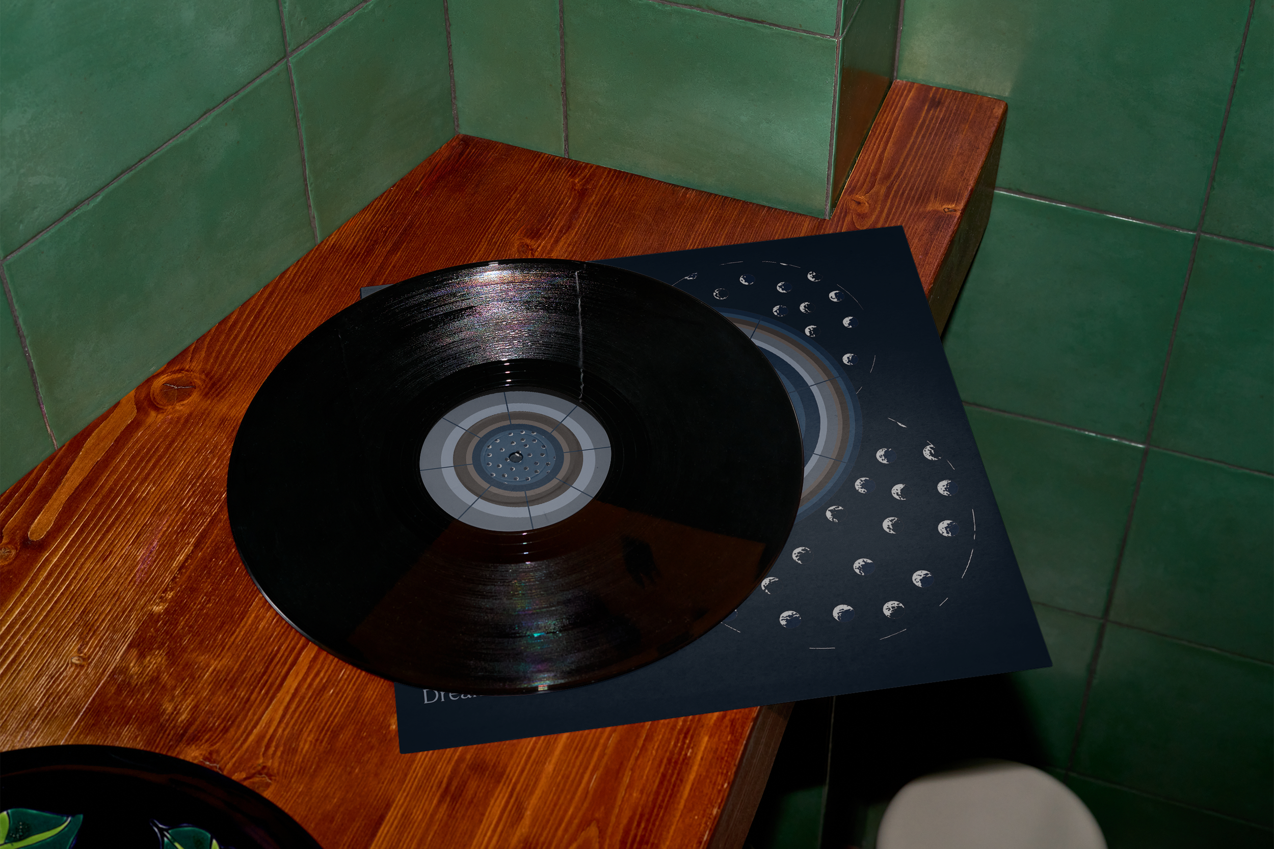
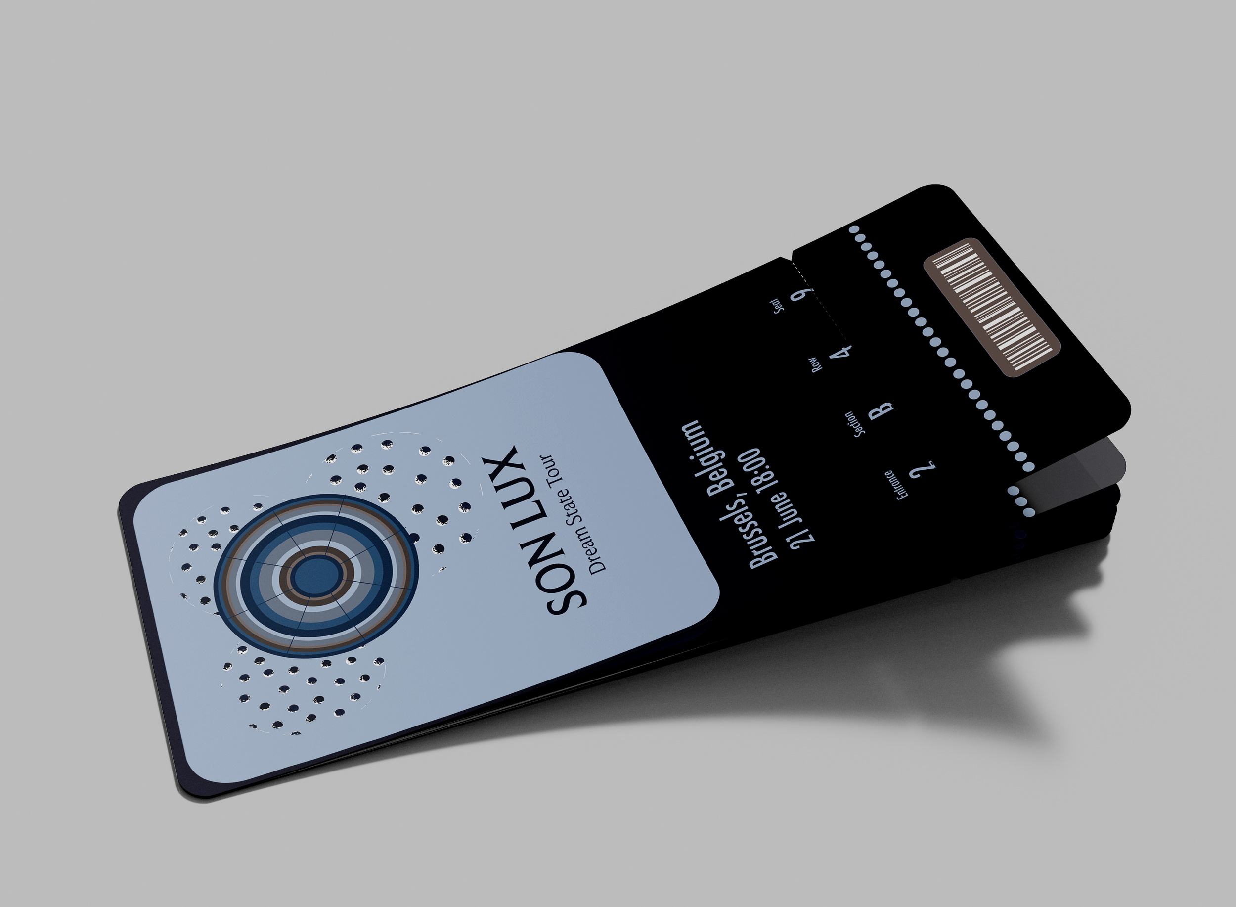
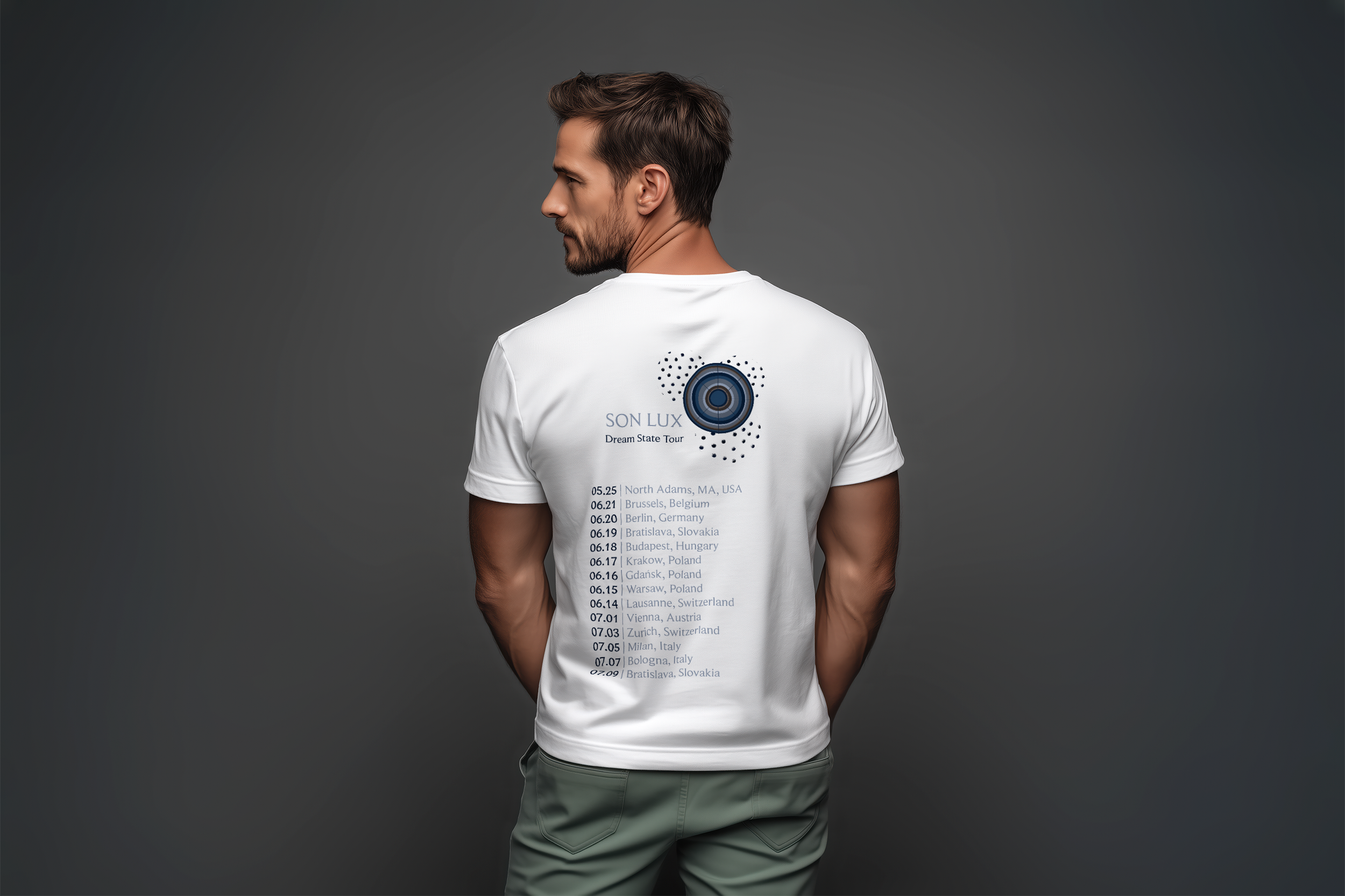
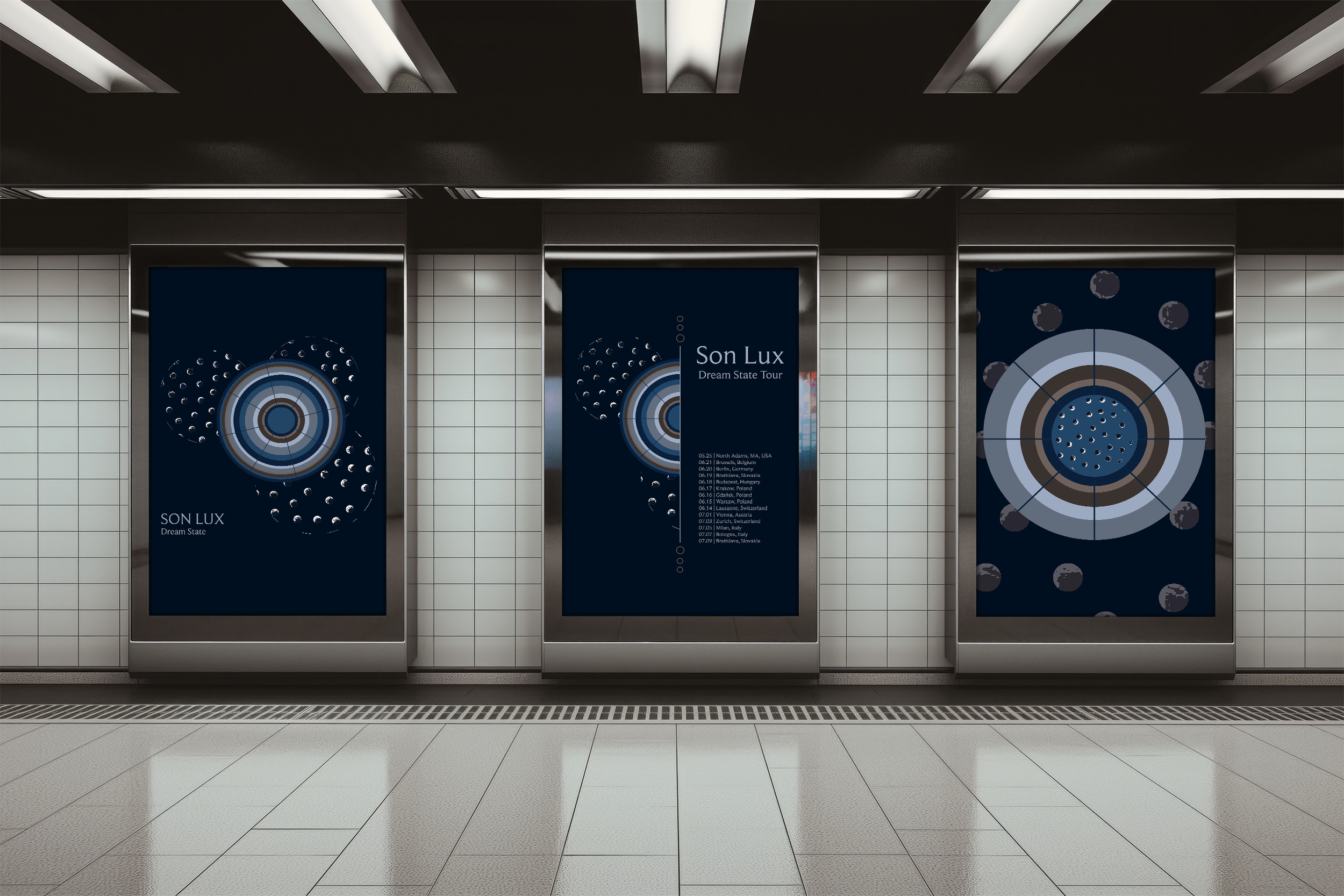
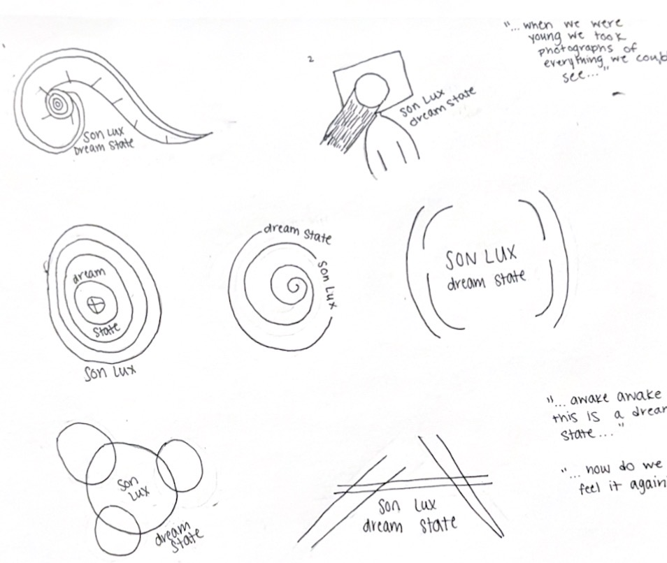
The design centers on geometric forms inspired by Son Lux’s established visual language of shape and anatomy, ensuring consistency with their existing work. Key lyrics from “Dream State,” including “when we were young we took photographs of everything we could see” and “awake, awake, this is a dream state… how do we feel it again,” guided the conceptual direction.
Camera lenses served as visual inspiration, translated into circular forms to reference photography. These elements were later manipulated to evoke a dreamlike state. A palette of blue tones was used to represent fear, pain, and beauty, while shades of brown symbolized renewal, unifying the design with the album as a whole.
Process

Final