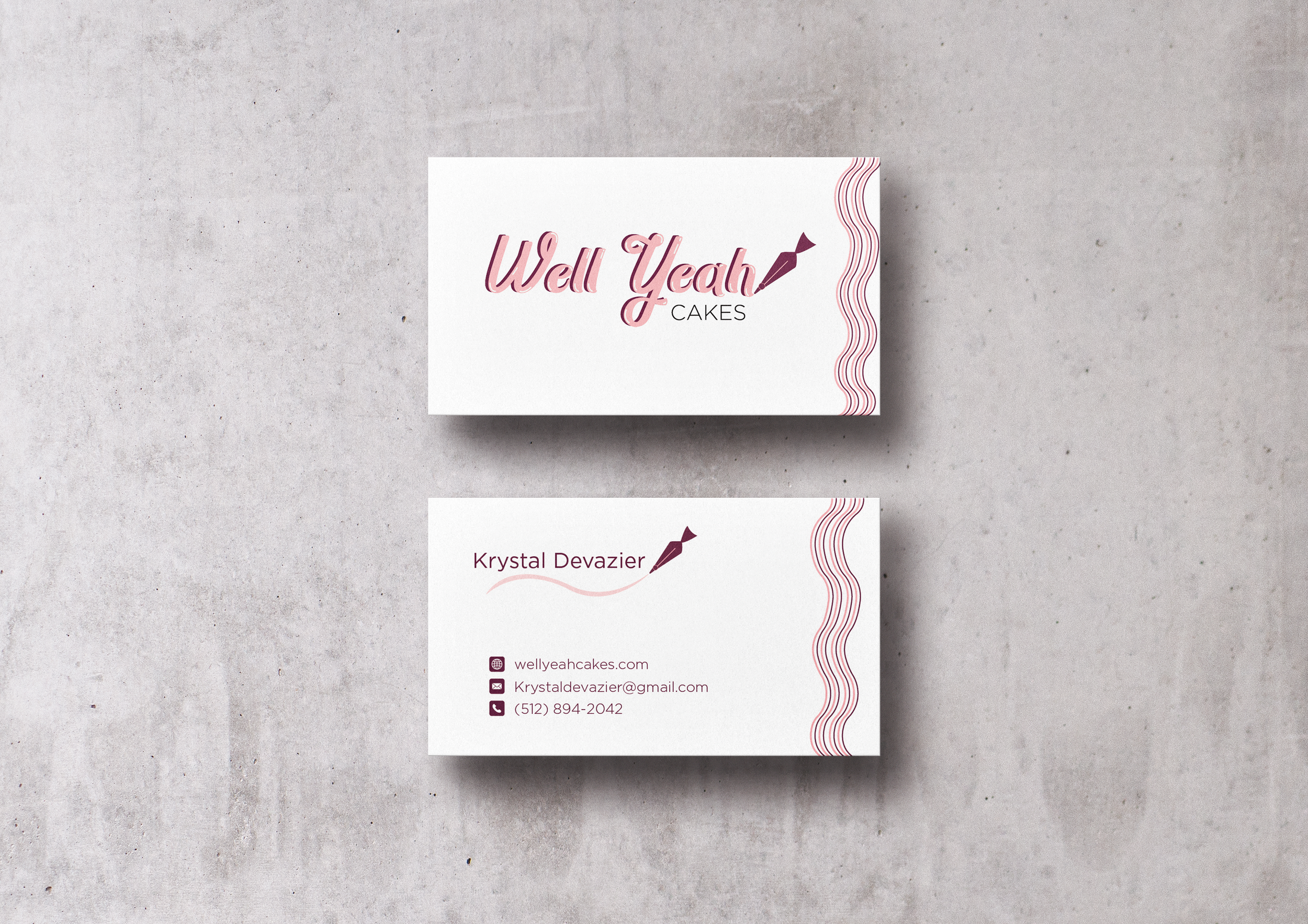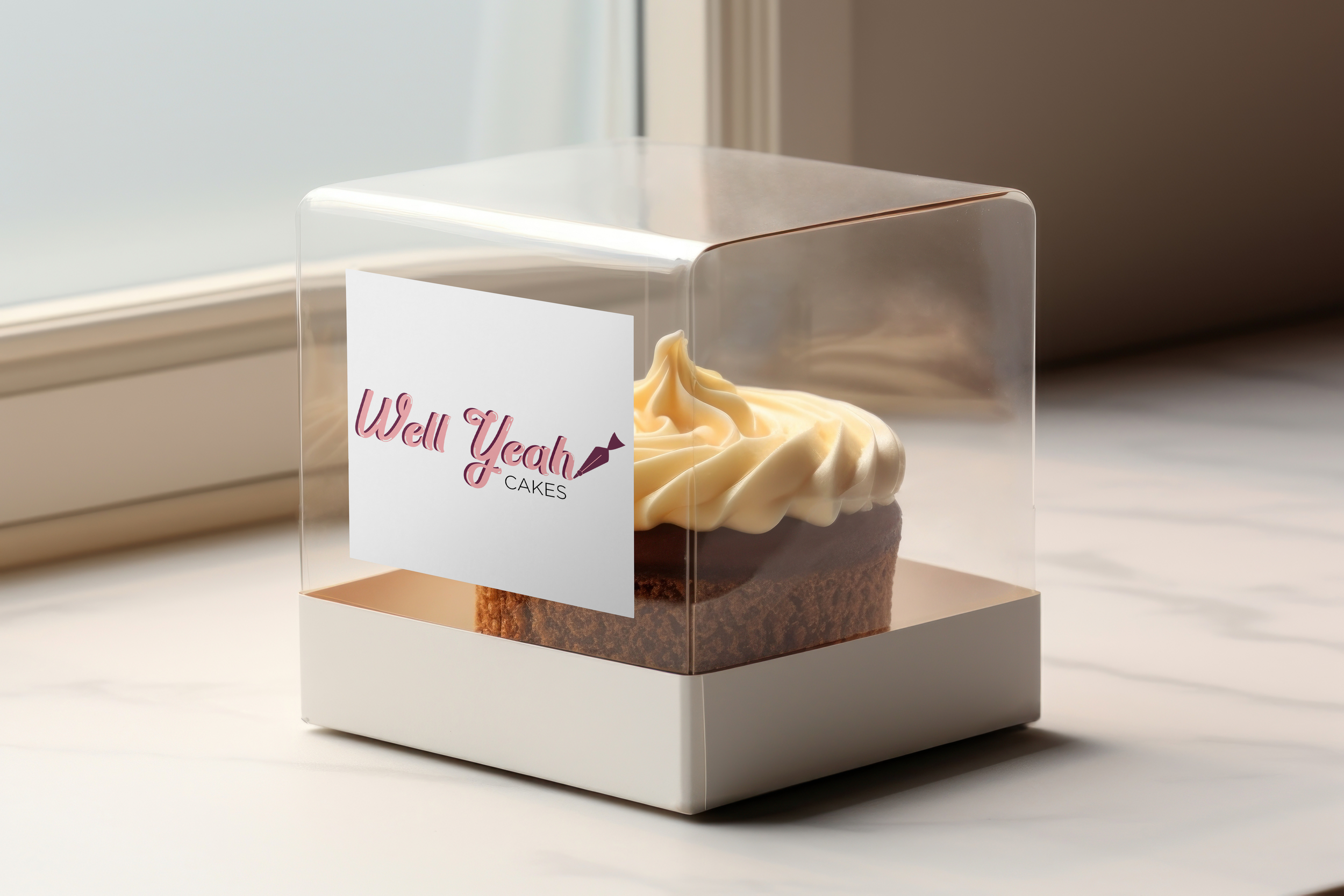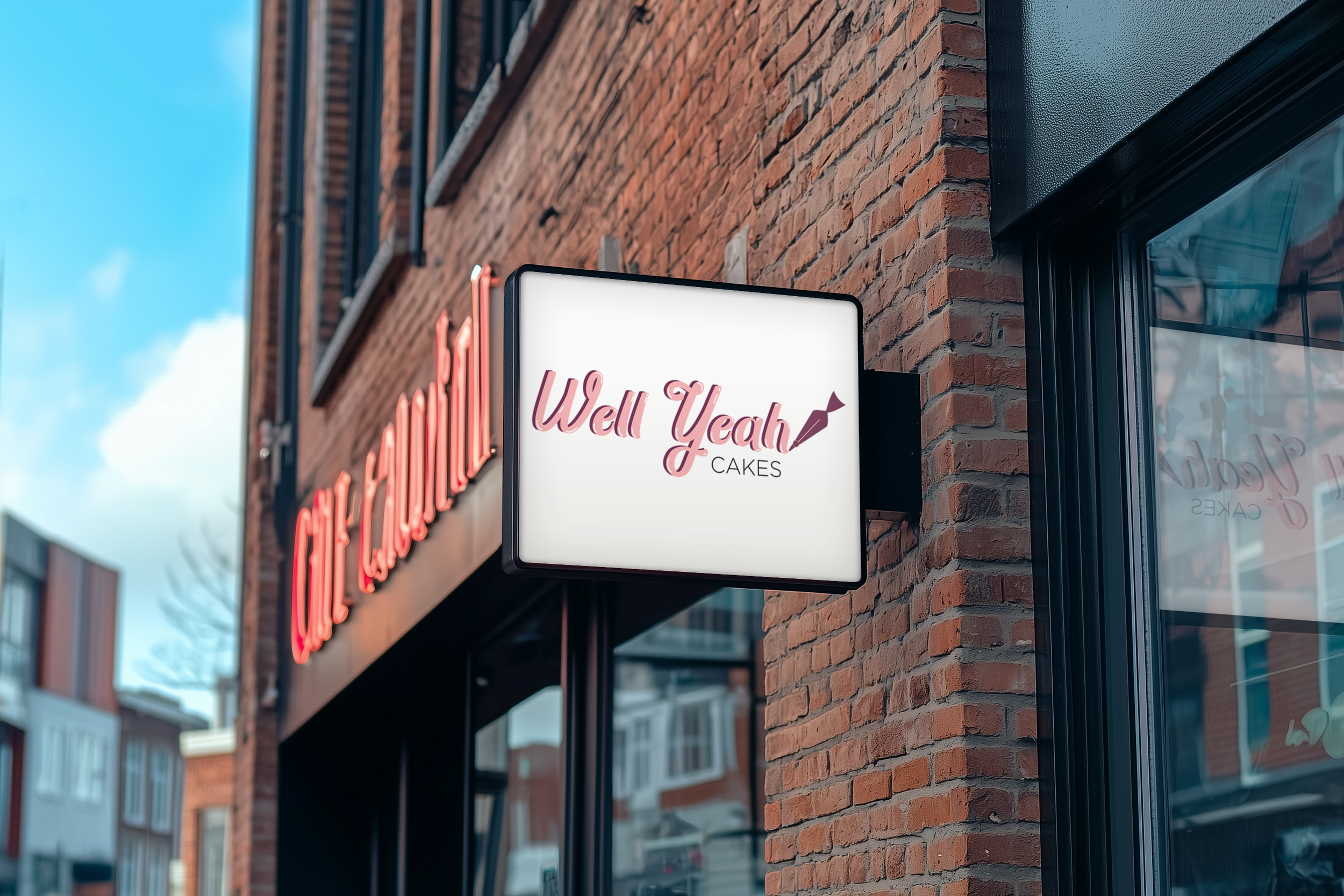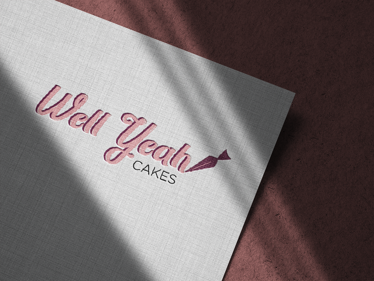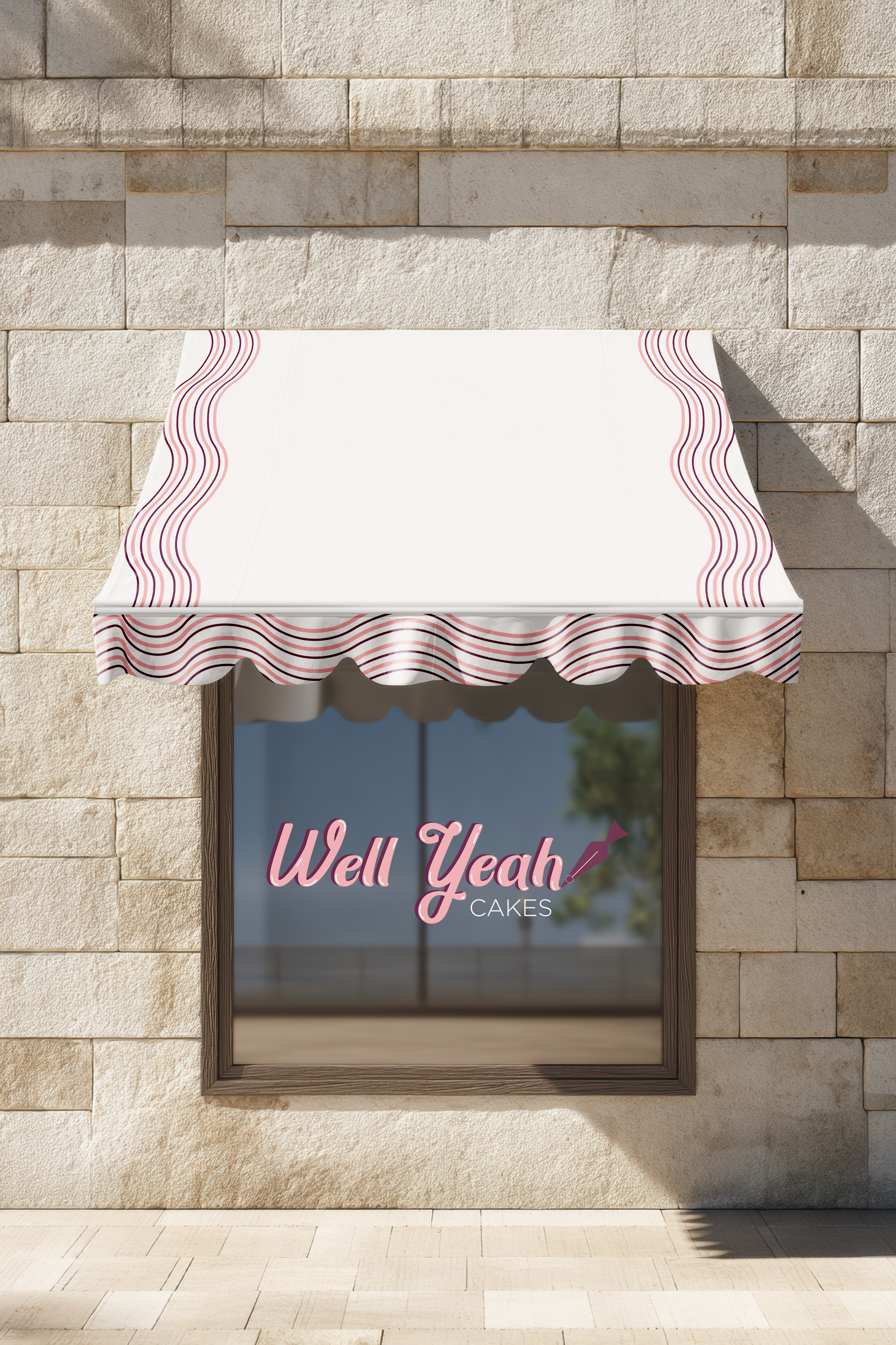
Well Yeah Cakes
Description
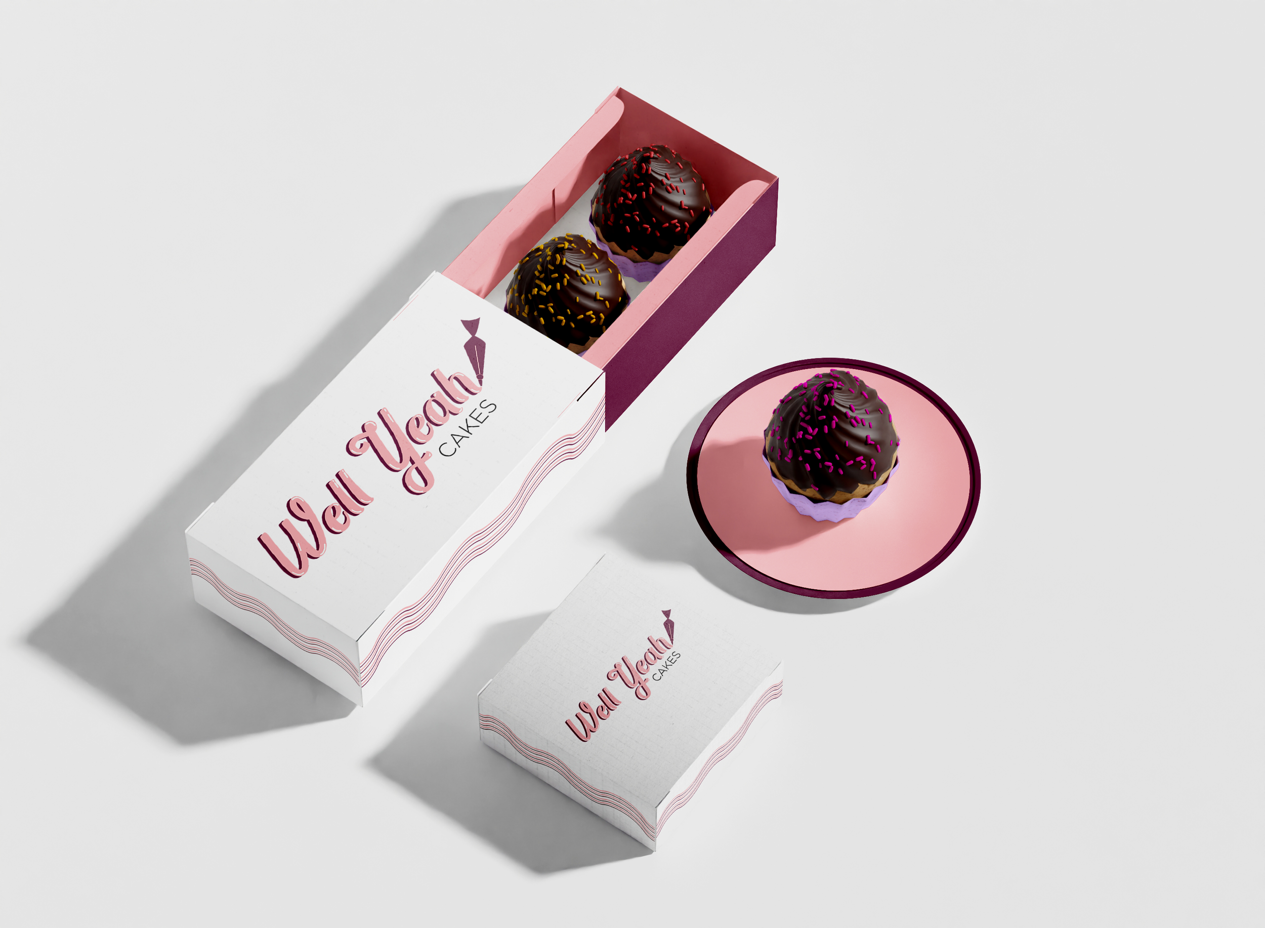
The goal of this project was to develop a refreshed logo identity for a small, locally owned business. I selected Well Yeah Cakes, a pastry shop based in Dripping Springs, Texas, known within the community for its custom-designed cakes and thoughtfully crafted pastries.
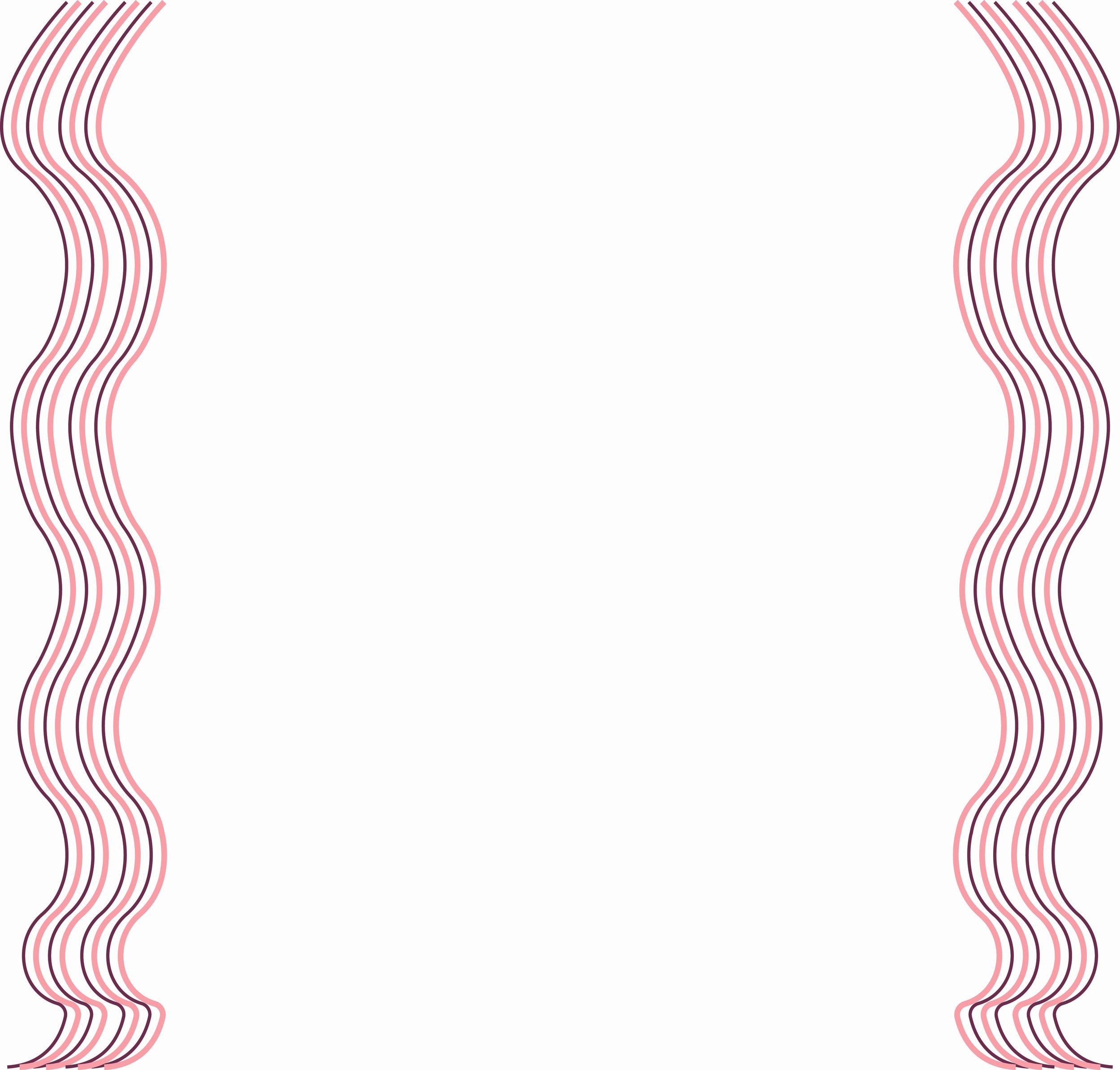
The concept focused on a minimal, clean, and delicate aesthetic. My visual direction drew inspiration from core baking elements, such as ingredients and the cake itself, to communicate the brand’s craftsmanship and attention to detail.
For the color palette, I focused on a range of pink shades, from light to dark, to complement the delicate, elegant feel of the script typeface used for the main logo. I also incorporated Gotham as a secondary typeface to provide a clean, modern balance.
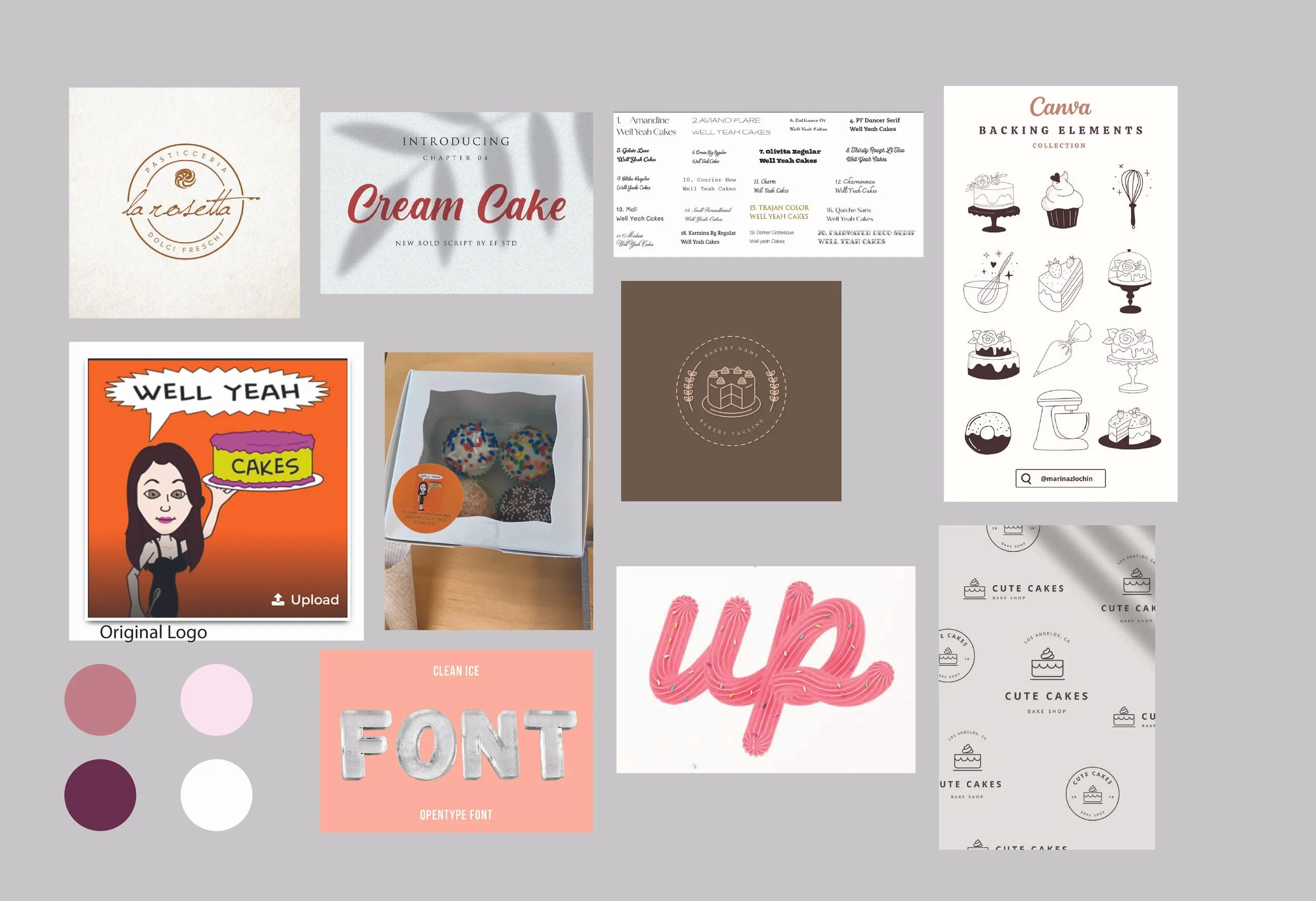
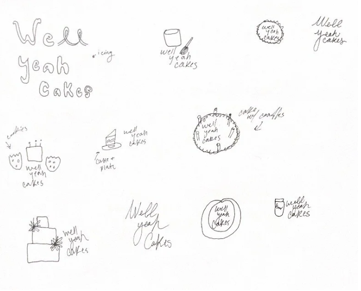
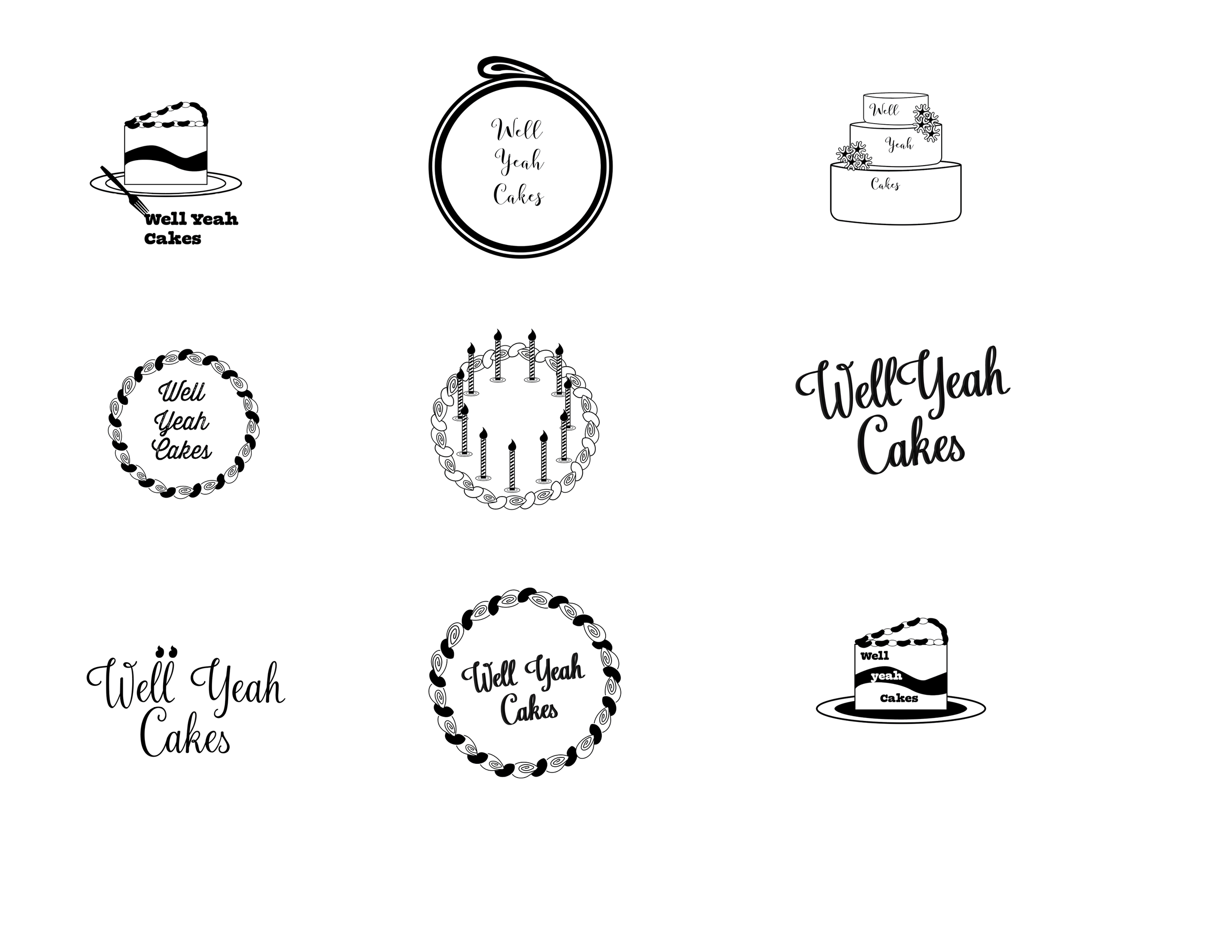
Process
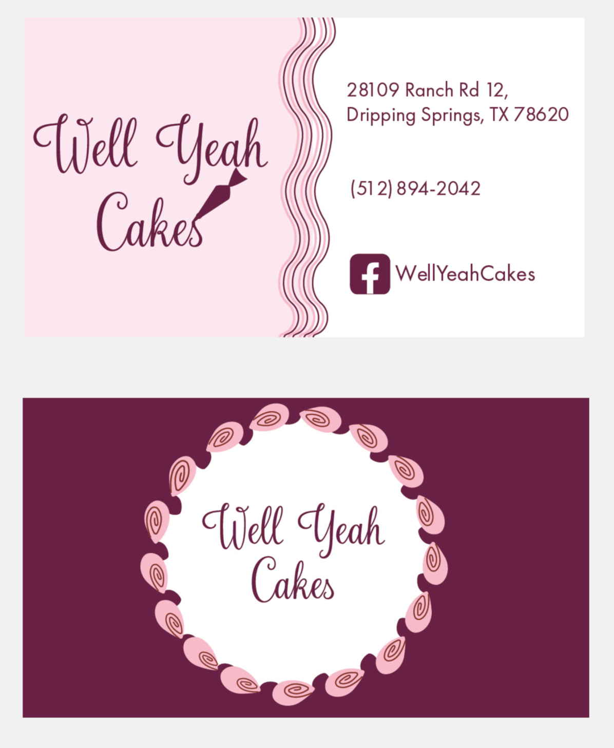
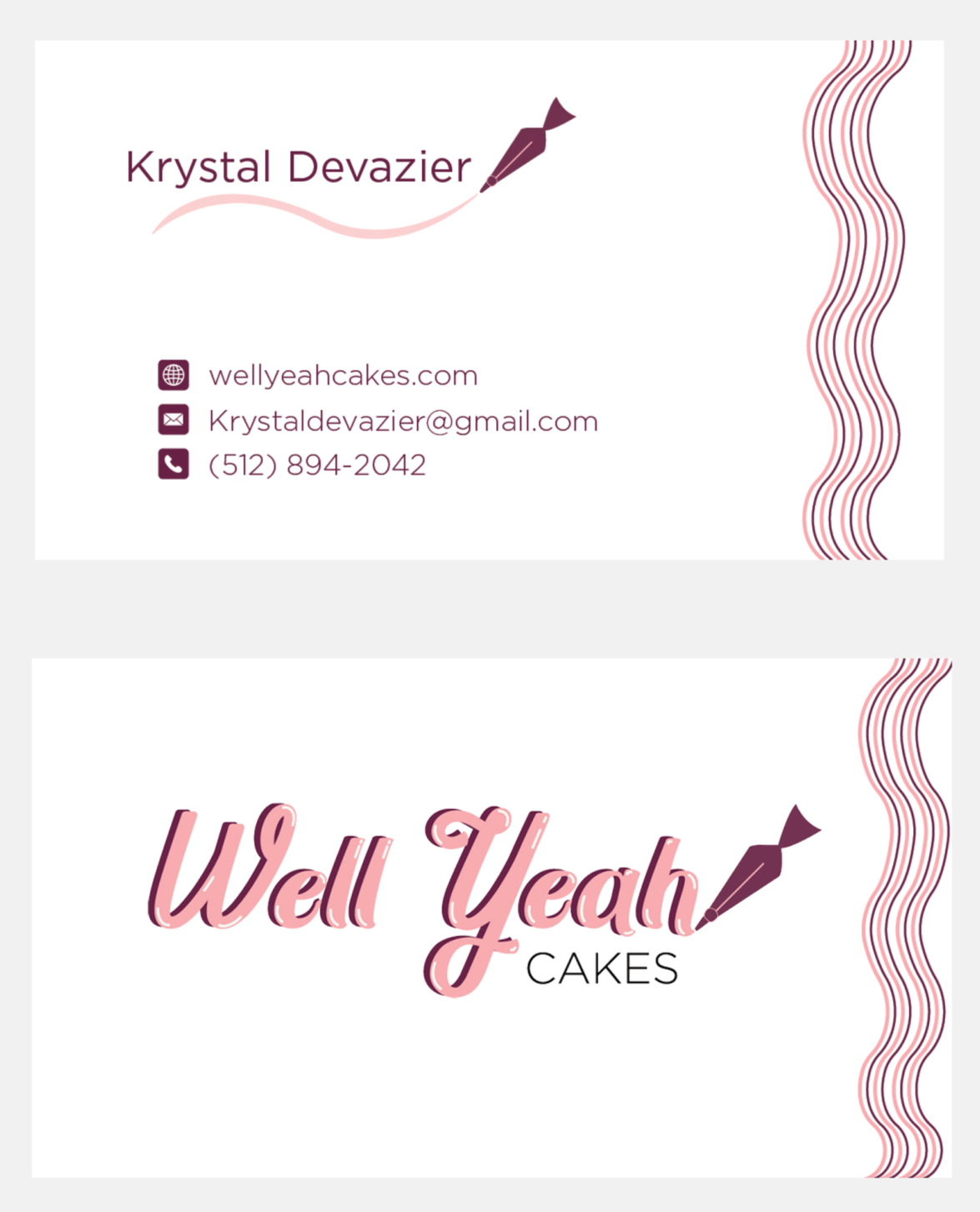
Final